Nat Geo | Brand Exploration (pitch)
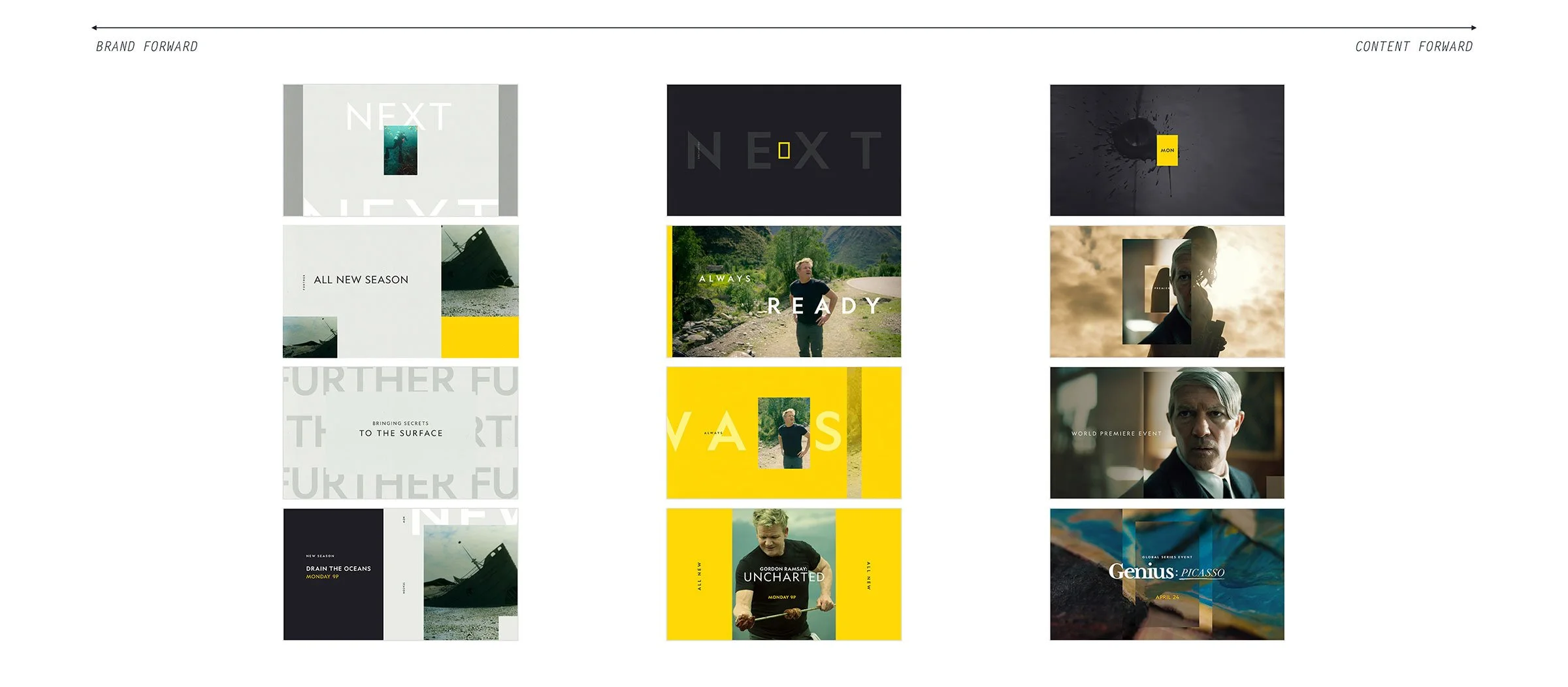
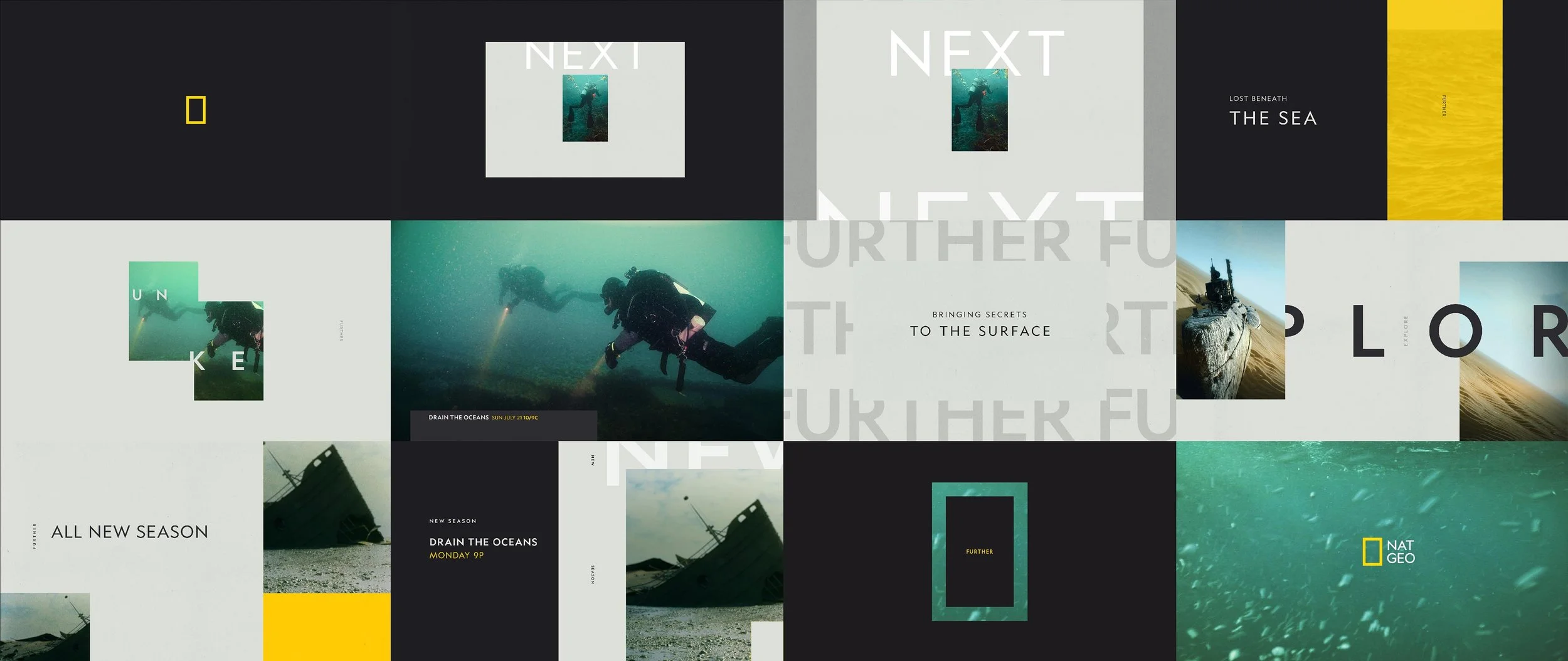
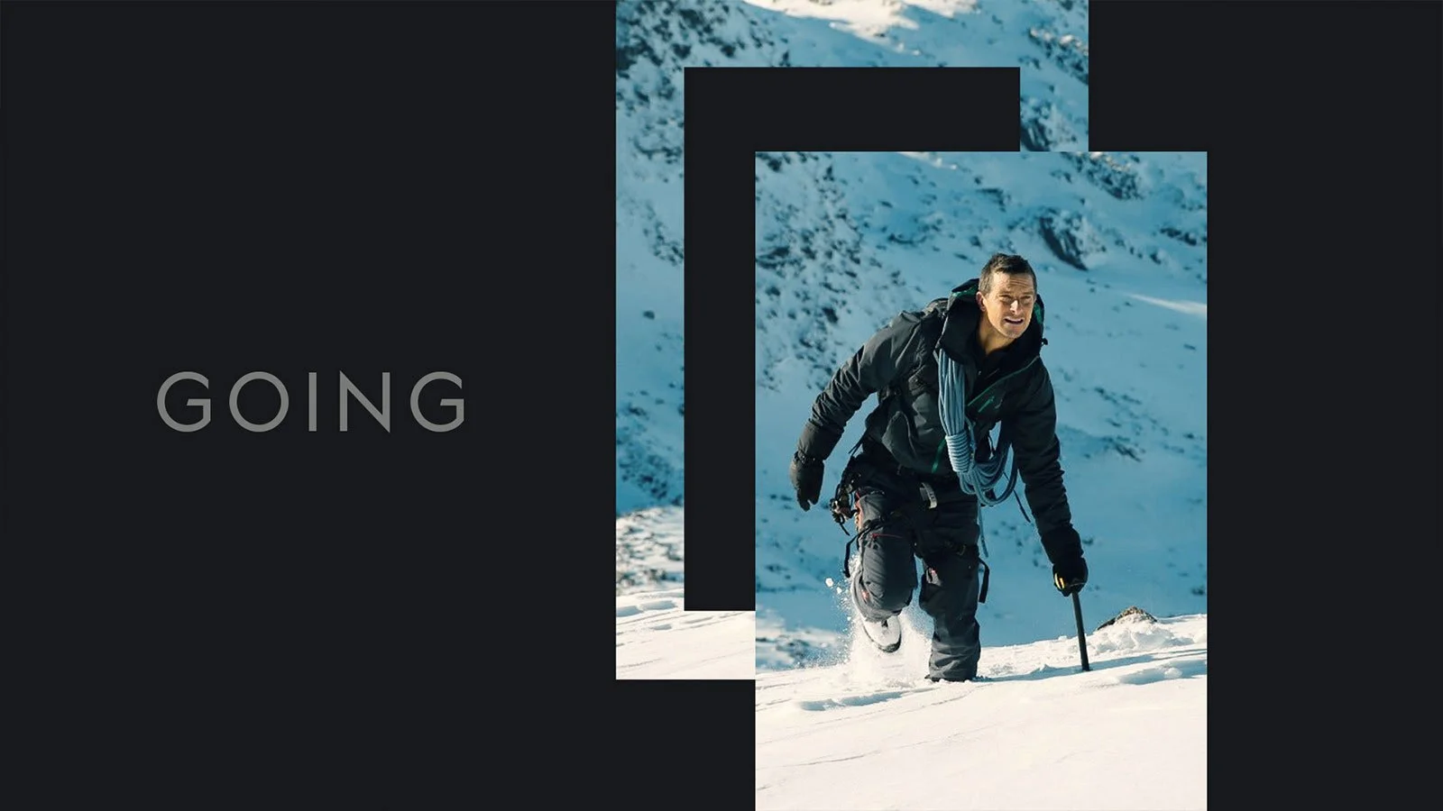
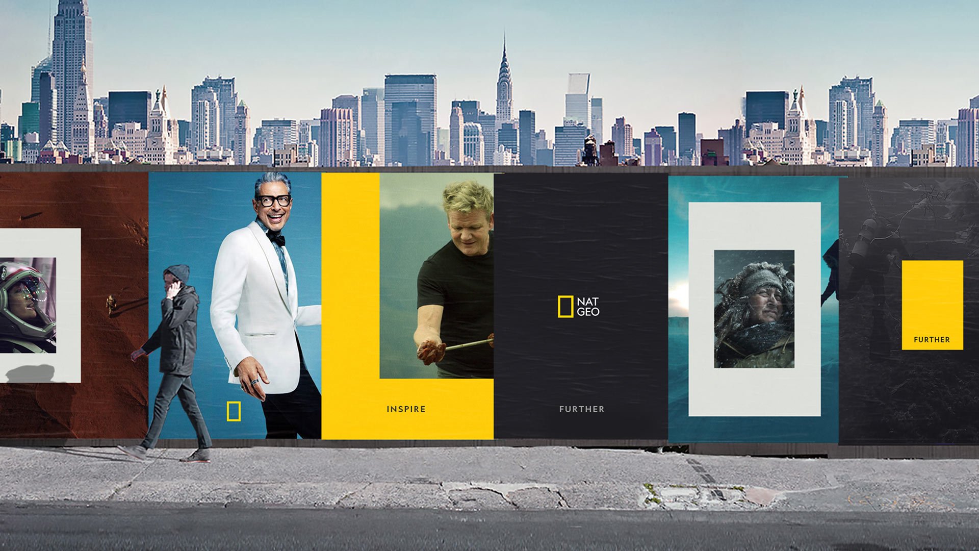
Nat Geo asked us to refresh their on-air brand to accommodate the new talent forward programming and scripted offerings without losing sight of the nature and exploration content they are known for. My concept, Reframed, embraced the iconic portal and the decades of equity it carries by infusing it into the graphics package with purpose and personality. It becomes the major design signature for the network as it is used to contain or isolate content and come alive through motion and scale.
Role: Concept, Design
Studio: Kill 2 Birds
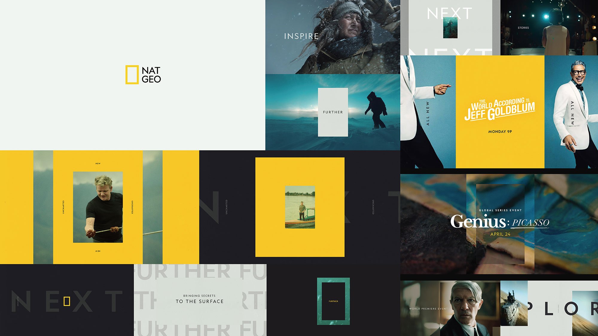
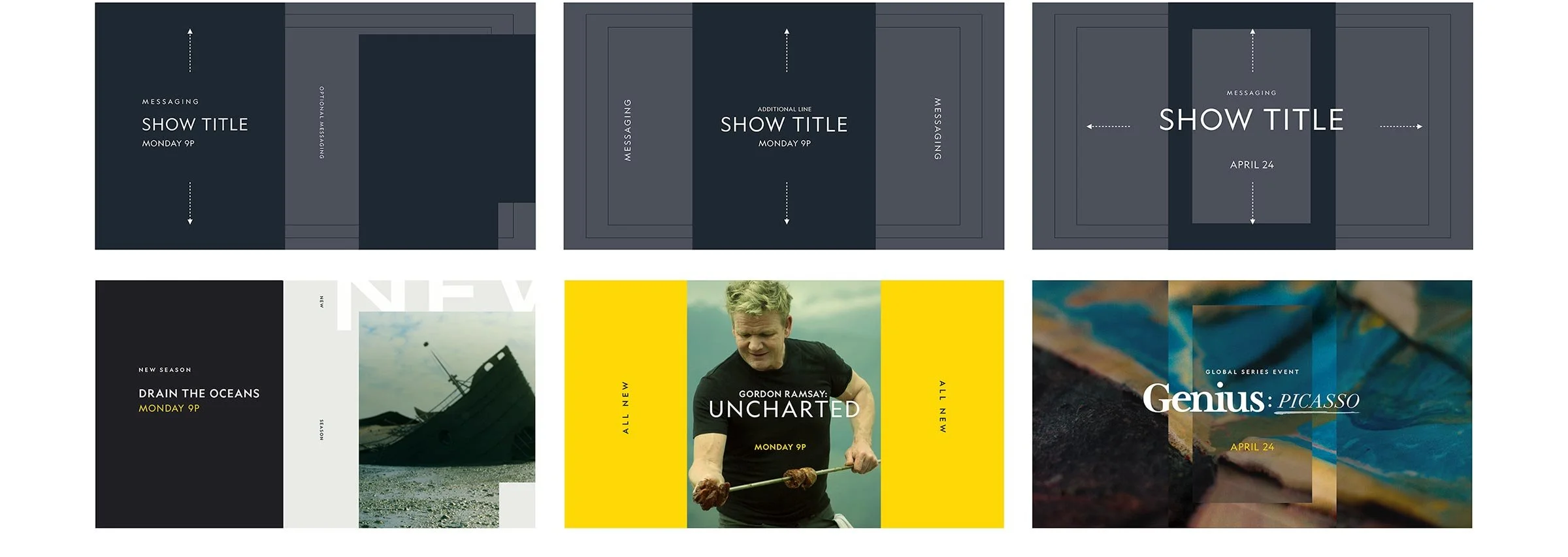
I developed a system that accommodates three levels of programming:
Brand Volume High
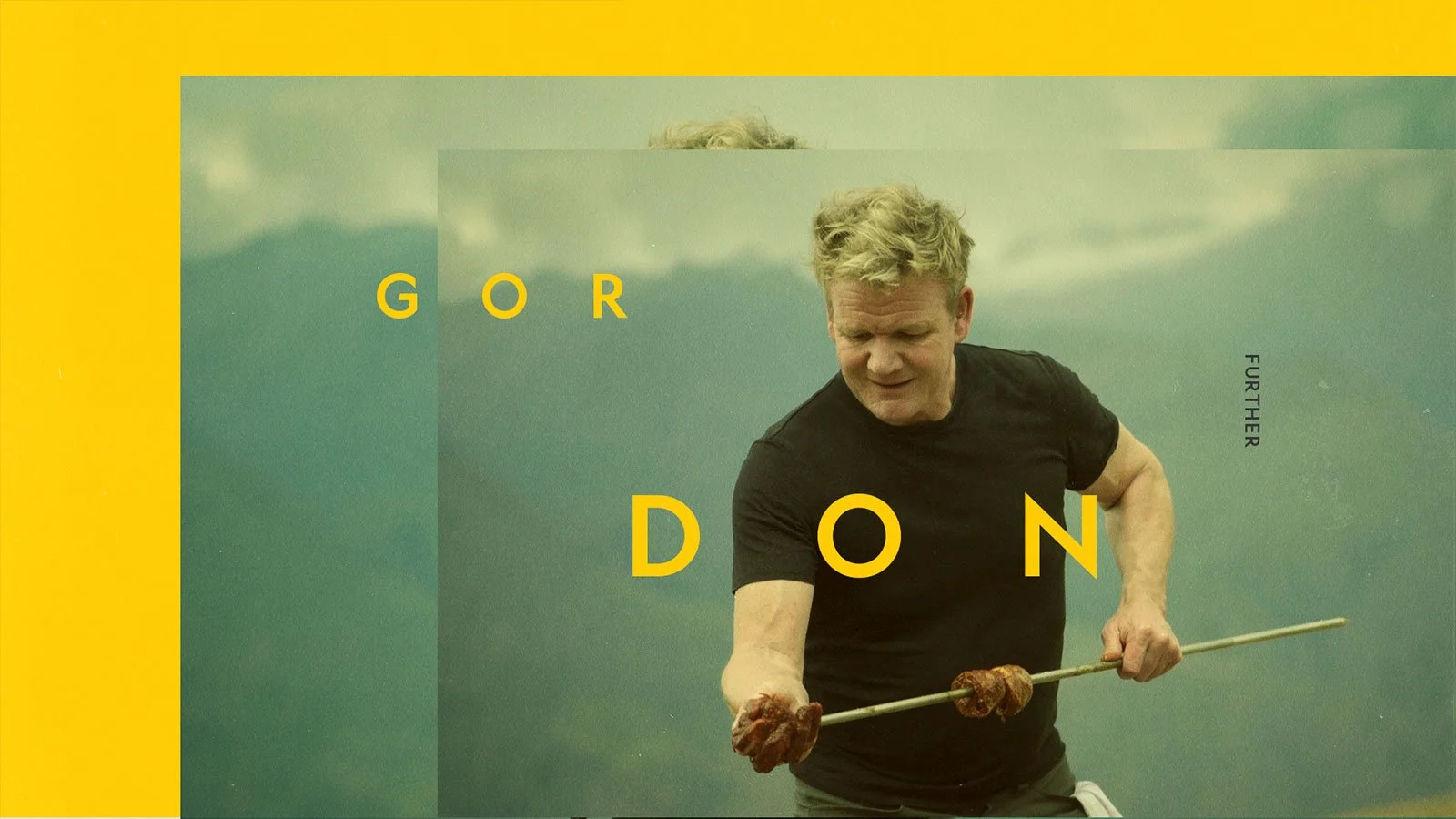
Brand Volume Mid - talent forward
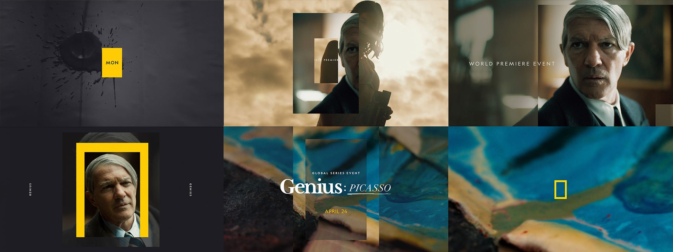
Brand volume Low - Specials & Events
Promo Endpage system
The frame is a simple graphic device but can function in a variety of ways to deliver content, initiate transitions, and create uniquely branded compositions.


